Boolean True False Toggles color outline icon





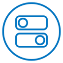
Two toggle bars inside a circle, one with a check mark knob and one with a cross knob
Related tags
About the Boolean True False Toggles color outline icon
Two stacked pill-shaped toggle bars sit inside a circular frame. The upper bar ends with a round knob on the right holding a check mark, while the lower bar carries its knob on the left with a cross inside, so the pair shows an on state above and an off state below. It reads as boolean logic, true and false, or enabled and disabled, and fits settings panels, feature flag dashboards, form validation, survey builders and programming tutorials.
The two bars are equal in length and mirrored left to right, which makes the opposition immediately legible, and the knob circles sit slightly proud of the bar height. Stroke weight is consistent across marks and frame. It pairs with switch, checkbox and condition icons; keep it above 32 px so the check and cross stay distinct.
This is the colour outline version of the boolean true false toggles icon: the same line drawing in an accent colour, useful for highlighting a state, a category or a brand tone without adding visual weight.
Download it free as a scalable SVG vector or transparent-background PNG in seven sizes (16 to 512px), copy the SVG code straight into your project, or open it in the free online editor to change colors, apply gold, silver, neon and gradient styles, animate it, or convert it to EPS, PDF and DXF.
Free for personal and commercial use with attribution.