
10 free photography icons for camera, gallery and media UI, in four styles
Ten photography icons — camera, gallery, film and frame — in outline, filled, colour-outline and colour-filled styles, free with attribution.
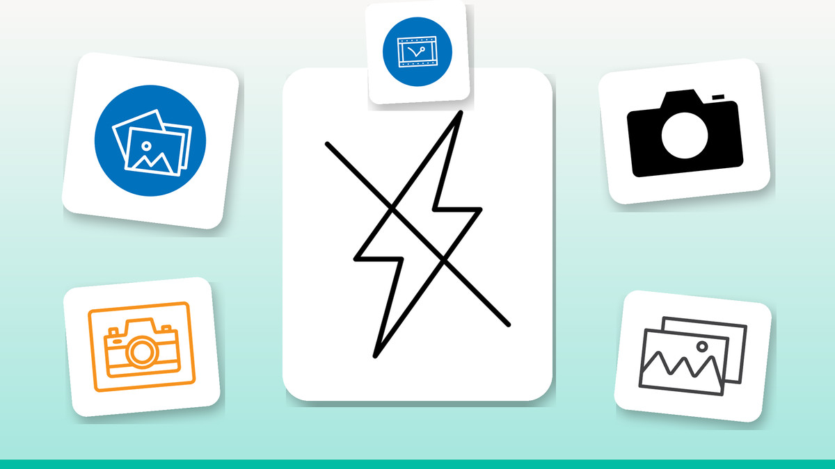
Every product with an upload button, a profile photo, or a gallery view eventually needs photography icons — and reaching for a random mix from five different sources is how UIs end up looking stitched together. This set covers the core photography vocabulary: capture, gallery, film, framing and the settings and restrictions that go with them, so a camera app, a portfolio site or a conference deck can pull every mark from one family instead of patching gaps.
We built these as outline, filled, colour-outline and colour-filled versions of the same shapes, so swapping a line icon for a solid one in a dark navigation bar doesn't mean hunting for a lookalike elsewhere. Stick to one style per screen, reserve colour-filled marks for primary actions like the shutter button, and use outline for secondary states such as flash toggles or gallery placeholders. All are vector, so they scale cleanly from a 16px toolbar icon to a full-bleed slide in a deck.
The icons

Flash off: a clear camera-setting toggle
A lightning bolt with a diagonal strike reads instantly as "no flash," which makes it the natural partner icon to a plain flash icon in a camera settings row. Use the outline version for the unselected state and switch to the colour-filled version when flash-off is active, so the toggle communicates state through both icon style and colour — not colour alone, which keeps it usable for colour-blind users.
Download free →
Photo stack: the shorthand for 'open gallery'
A stack of overlapping photo squares is the fastest way to say "your saved images live here," which is why it works so well as a gallery tab or an album-list row icon. Because the layered shape stays legible even small, it holds up at 20–24px in a bottom navigation bar — use the filled version there for better contrast against a dense icon row, and the outline version inside a larger empty-state illustration.
Download free →
A plain camera icon for the action itself
This is the baseline camera glyph — a body, lens and viewfinder bump, no extra badges or frames — so it's the one to reach for whenever the action is simply "take" or "add" a photo, not browse one. Use the colour-filled version for a primary capture button and the outline version for a secondary "attach photo" option next to a document uploader, so the two don't compete for attention.
Download free →
Camera in a badge, built for avatar editing
Framing the camera inside a rounded square turns it into a self-contained badge rather than a full toolbar icon, which is exactly what an avatar-edit overlay needs. Anchor it to the bottom-right corner of a profile photo at roughly a quarter of the avatar's diameter, using the colour-filled style so it reads as tappable against a photo background of any colour, and keep the outline version for a lighter "edit cover photo" variant elsewhere.
Download free →
The classic mountain-and-sun image mark
The mountain peak with a small sun in the corner is the most universally recognised "this is an image" symbol on the web, which makes it the right choice for a broken-image fallback, an empty gallery state, or a generic "add photo" placeholder in a form. Keep it in the outline style so it reads as a placeholder rather than real content, and size it no smaller than 32px — the peaks lose their sun detail below that.
Download free →
Film strip: the instant cue for video or cinema
A strip of film with sprocket holes down the side signals motion picture content the moment someone sees it, so it's the better choice over a plain camera whenever a section mixes photos and video — a media library tab, a "behind the scenes" reel, or a film festival programme. Pair it next to the plain camera icon in a segmented control so users can tell the photo tab from the video tab at a glance, without reading the labels.
Download free →
A DSLR-style camera for pro photography features
With a more pronounced lens barrel and grip, this reads as a dedicated photography tool rather than a phone snapshot, so it's the better fit for a DSLR-settings menu, a photography course landing page, or a "switch to pro mode" toggle. Reserve the simpler camera glyph for everyday capture actions and bring this one out specifically when the feature is about photography as a craft — manual exposure, lens choice, RAW export — so the icon vocabulary matches the audience.
Download free →
A clear no-selfie sign for venue and safety UI
A phone-on-a-stick inside a red prohibition circle is unambiguous even without a caption, which is exactly what venue and safety communication needs — a museum app's gallery rules screen, event signage graphics, or a workplace safety poster. Use the colour-filled version wherever the icon has to work at a glance from a distance, like printed signage or a full-screen warning, and drop to the outline version only in dense help-text lists where colour would be visual noise.
Download free →
A hanging frame for wall art and decor contexts
A picture in a frame, hung the way it would sit on a wall, is built for decor and print contexts rather than digital galleries — think a poster or canvas print shop, an interior-design app's "preview on your wall" tool, or a print-on-demand category icon. The colour-outline style suits this one particularly well: it keeps the frame legible while adding just enough colour to feel like art rather than a plain UI glyph, useful on marketing pages.
Download free →
A circular stacked-photos mark for nav and tabs
Wrapping the stacked-photos shape in a circular boundary makes it drop straight into any nav system built on round tabs or avatar-style buttons, without needing a separate crop or mask. It's a strong match for a mobile app's bottom-tab gallery entry or a circular quick-action button on a photo-sharing dashboard. Keep it at the same optical size as the other tab icons around it — circular shapes read slightly larger than square ones at the same pixel dimensions.
Download free →Getting the most from a photography icon set
- Pick one style per screen — mixing outline and colour-filled camera icons in the same row reads as inconsistent, not intentional.
- Reserve colour-filled icons for primary actions like the shutter button or capture CTA, so they don't compete with navigation icons.
- Keep prohibition marks like the no-selfie sign in their original red-and-white colouring — recolouring a warning icon undermines its meaning.
- Size gallery and film-strip icons no smaller than 20px; fine details like sprocket holes and stacked edges disappear below that.
- All formats export as SVG, so scale them for a favicon-sized toolbar button or a full-width hero graphic without any quality loss.
Browse the full library at infyicon.com.
FAQ
Which style should I use for a mobile app — outline or filled?
Use outline icons for unselected or secondary states, like inactive tab items, and switch to filled or colour-filled for the active state or primary actions such as the shutter button. This gives users a clear visual cue for what's tappable versus what's informational.
Can I use these icons for signage, like a no-photography notice in a venue?
Yes — the no-selfie sign works well printed at large sizes because it's a vector file, so it stays sharp on a poster or door sign. Keep the colour-filled version for physical signage since the red prohibition ring needs to read from a distance.
Do I need to credit Infyicon if I use these icons in a client project?
These icons are free to use with attribution, so credit Infyicon when you use them, including in client work. Keep the attribution visible wherever the final design is published.
Start small: swap one ad-hoc camera or gallery icon in your current project for one of these, and check how it looks next to your existing UI before rolling out the full set. Once the outline and colour-filled versions are both in your file, switching states — active tab, hover, disabled — becomes a one-click swap instead of a redraw.