
How to Pick a Consistent Email Icon Set for Your Design System
Ten email and envelope icon styles compared by weight, fill and colour so mail, inbox and message states stay consistent across your product.
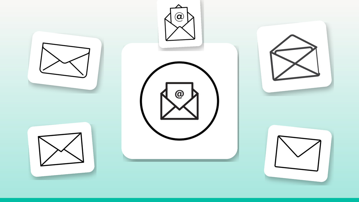
Email is one of the most reused icons in any interface — login screens, inbox lists, contact forms, CTAs, notification badges — yet it's also one of the most inconsistently drawn, because teams grab whichever envelope looks closest instead of picking a matched family. That mismatch shows up fast: slightly different flap angles, stroke weights or corner radii sitting side by side and quietly signalling a sloppier product than the one you built.
Our practical take: treat email icons like a typeface, not a one-off asset. Choose one outline weight for interface chrome, one filled counterpart for active or pressed states, and reserve colour and open-envelope variants for the moments where they actually carry meaning — read/unread status, marketing sections or empty states. Below are ten Infyicon email designs mapped to exactly those jobs.
The icons

The default outline for nav bars and toolbars
A plain closed-envelope outline with an even stroke reads cleanly at typical UI sizes of 16–24px without clutter. It's the safest default state icon because it doesn't compete with surrounding text or badges. Use it as the resting-state icon in a top nav or sidebar, then swap to a filled variant on hover, focus or active states so the change in state is visible, not just implied.
Download free →
A filled match for active and pressed states
Solid fill on the same envelope silhouette holds up better than an outline at very small sizes or on busy backgrounds, since there's no thin stroke to disappear against colour or texture. Use it as the paired active/selected icon for email-7 rather than sourcing a filled envelope from elsewhere — matching flap geometry and proportions between the pair is what makes the state change feel intentional instead of accidental.
Download free →
An open envelope that communicates status without colour
Showing the letter partly out of the envelope gives you a shape-based way to signal "read" or "opened" that doesn't rely on colour or a dot badge, which matters for accessibility. Use it in an inbox or message list next to a closed envelope for unread items — the silhouette difference alone communicates state to users who can't distinguish colour, and it still reads correctly in greyscale or print exports.
Download free →
A rounded, slightly heavier build for touch targets
Softer corners and a marginally heavier stroke give this envelope more presence at the small, tappable sizes common on mobile — icon-only buttons, bottom tab bars, floating action menus. Use it where thumbs, not cursors, are doing the tapping and where a too-thin line risks looking faint on lower-density mobile screens. Keep the same weight across any other icons sharing that tab bar for visual balance.
Download free →
A colour-filled envelope for marketing and empty states
Full colour fill draws the eye immediately, which is exactly what you want outside the neutral chrome of an app shell — a zero-inbox empty state, a newsletter signup block, an onboarding step for email verification. Use it sparingly and only where the surrounding UI is otherwise low on colour, so it functions as an intentional accent rather than competing with a colourful outline set nearby.
Download free →
A thin-line envelope for dense, text-heavy layouts
A lighter stroke keeps this variant unobtrusive next to labels in settings screens, form field prefixes and data tables, where a heavier icon would visually outweigh the surrounding copy. Use it inline before a contact-email field label or as a leading icon in a compact list row, and keep it at 16px or below — thinner strokes lose crispness once scaled much larger.
Download free →
A colour-outline hybrid for onboarding illustrations
Keeping the stroke structure of an outline icon but tinting it in brand colour bridges plain UI icons and full-colour illustration without a jarring style jump. Use it in onboarding carousels or feature-highlight cards where you want brand colour present but still want the icon to visually belong next to neutral outline icons elsewhere on the same screen, rather than looking like a different icon family entirely.
Download free →
A bold, simplified shape built for tiny sizes
Reduced detail and thicker geometry mean this envelope keeps its silhouette recognisable at sizes where fine strokes disappear — 16px notification badges, favicons, browser tab icons. Use it anywhere the icon has to survive heavy downscaling, such as a red-dot notification badge on a toolbar icon, rather than shrinking a detailed outline variant and hoping the flap lines stay visible.
Download free →
A classic envelope with visible flap seam for larger sizes
The extra construction detail — a defined flap line and seam — only reads clearly once the icon is large enough to show it, so this variant is built for bigger placements: empty-state illustrations, pricing cards, feature grids. Use it anywhere above roughly 32px; at smaller UI sizes the added detail crowds together and the icon loses the crispness of the simpler variants.
Download free →
An envelope-plus-bubble for disambiguating channels
Combining an envelope with a message bubble distinguishes email notifications from in-app chat or SMS when a product surfaces both, which a plain envelope can't do on its own. Use it specifically in notification centres or settings toggles where users choose between "email me" and "message me" — reserve the plain envelope variants for anywhere email is the only channel, to avoid mixing metaphors.
Download free →Building the set without it looking mismatched
- Pick one outline stroke weight and one fill style, then use only those two across the whole product.
- Never mix envelope icons from different families in the same list, nav bar or toolbar.
- Check every icon at its real rendered size — 16px and 24px — not just at export size.
- Reserve colour-filled and colour-outline variants for marketing, onboarding or empty states only.
- Export as SVG so stroke width and corner radius stay crisp across every screen density.
Browse the full library at infyicon.com.
FAQ
Should I use outline or filled email icons in my interface?
Use outline as the resting/default state for navigation and toolbars, and filled for active, selected or pressed states. This gives users a visible state change without needing colour, and keeps the interface calm since outline icons carry less visual weight than solid ones.
When is it actually okay to add colour to an email icon?
Add colour where the icon is doing marketing or emotional work rather than interface labelling — empty states, onboarding, newsletter CTAs. In dense UI like nav bars, settings lists or tables, keep it neutral so colour stays meaningful elsewhere, like error states or notification badges.
What file format should I use for email icons across web and mobile?
Export as SVG for both platforms; it scales cleanly from a 16px favicon to a large empty-state graphic without re-exporting, and lets you recolour via CSS or tint properties instead of maintaining separate coloured PNGs for each brand theme.
A consistent email icon set is a small change that reads as a much more polished product, and it costs nothing beyond picking a matched outline/filled pair and sticking to it. Start this week by auditing every email icon already live in your product, replace the mismatched ones with one outline and one filled variant from this set, and save colour for the one or two places it actually earns its keep.